Key ideas
Since we have shown in the simulation that the PLIS procedure has a higher sensitivity of nearby SNPs to causal SNPs even if the causal SNPs are missing in the dataset, we have evidence to believe that when applying PLIS procedure to a real dataset, we can get more accurate results. Thus, we applied PLIS procedure to a real T1D GWAS summary statistics, and we compared its ranking to the ranking given by p-values.
Setting up
library(dplyr)
library(data.table)
library(ggplot2)
library(PLIS)
t1d <- fread("snp_big_data.csv")
head(t1d)
variant_id p_value chromosome base_pair_location effect_allele
1: rs7526076 0.5654675 1 998395 A
2: rs11584349 0.3881207 1 1000156 C
3: rs4970401 0.3966680 1 1001177 G
4: rs4246502 0.3751197 1 1002932 C
5: rs4075116 0.3566740 1 1003629 C
6: rs4326571 0.4392605 1 1006990 G
other_allele effect_allele_frequency odds_ratio ci_lower ci_upper
1: G 0.263988 1.010156 0.9759398 1.045571
2: T 0.274817 1.015061 0.9811786 1.050113
3: C 0.275058 1.014723 0.9810008 1.049604
4: G 0.270421 1.015518 0.9815421 1.050669
5: T 0.275140 1.015959 0.9823225 1.050748
6: A 0.282439 1.013269 0.9799802 1.047689
beta standard_error
1: 0.01010454 0.01758107
2: 0.01494871 0.01732119
3: 0.01461542 0.01724356
4: 0.01539850 0.01736169
5: 0.01583342 0.01717810
6: 0.01318202 0.01704331# This function calculate z-score when given the p-values and odds ratios
calculate_zvalue = function(p_value,odds_ratio){
# Creat a new vector to store all Z-scores of the two-tailed z-test
ZSCORE = c()
# Find the z-score for each SNP
for (i in 1:length(p_value)) {
# If Odd Ratio > 1, z-score is the integrated area above the p-value
if(odds_ratio[i] > 1){
ZSCORE[i] = qnorm(p_value[i]/2,0,1,lower.tail=FALSE)
}
# Otherwise, z-score is the integrated area below the p-value
else{
ZSCORE[i] = qnorm(p_value[i]/2,0,1,lower.tail=TRUE)
}
}
# Append z-score to our dataset
return(ZSCORE)
}Exploring the dataset
Dimension
#check the dimension of the big dataset
dim(t1d)
[1] 6294828 12SNP count on chromosomes
# check the number of available SNPs on each of the 23 chromosomes in this dataset
chrcount = c()
for (i in 1:23){
  print(paste("chromosome",i,": ",nrow(t1d[which(t1d[,"chromosome"]==i),])))
  chrcount = c(chrcount, nrow(t1d[which(t1d[,"chromosome"]==i)]))
}
[1] "chromosome 1 : 478921"
[1] "chromosome 2 : 535137"
[1] "chromosome 3 : 456314"
[1] "chromosome 4 : 466093"
[1] "chromosome 5 : 417476"
[1] "chromosome 6 : 429667"
[1] "chromosome 7 : 368260"
[1] "chromosome 8 : 358497"
[1] "chromosome 9 : 270655"
[1] "chromosome 10 : 329143"
[1] "chromosome 11 : 318823"
[1] "chromosome 12 : 306730"
[1] "chromosome 13 : 241402"
[1] "chromosome 14 : 206881"
[1] "chromosome 15 : 177280"
[1] "chromosome 16 : 185474"
[1] "chromosome 17 : 150432"
[1] "chromosome 18 : 181497"
[1] "chromosome 19 : 111075"
[1] "chromosome 20 : 139334"
[1] "chromosome 21 : 86382"
[1] "chromosome 22 : 79355"
[1] "chromosome 23 : 0"ggplot(t1d, aes(x=chromosome))+
geom_histogram(binwidth=1,color="white", fill="lightgrey")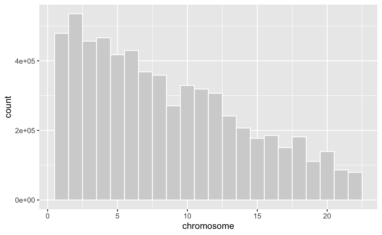
Applying EM algorithm to calculate LIS test statistic value for each SNP
SNP = c()
LIS = c()

# We only check the first 22 chromosomes here
for (i in 1:22){
  # Check how many SNP on chromosome i this dataset contains
  chr=t1d[which(t1d[,"chromosome"]==i),]

  # Randomly choose 5000 SNPs on chromosome i
  chr_sample = sample_n(chr, 5000, replace=FALSE)

  # Make sure that these SNPs are ordered by their physical base pair locations
  chr_sample <- chr_sample[order(chr_sample[,"base_pair_location"]),]

  # Calculate z-values for each SNP
  chr_sample$z = calculate_zvalue(chr_sample$p_value, chr_sample$odds_ratio)

  # Applying EM algorithm to infer from the z-values to the hidden states - whether each SNP is associated with the disease or not
  chr_sample.L2rlts=em.hmm(chr_sample$z, L = 2)

  #Bind the results together into one big dataframe
  SNP = rbind(SNP, chr_sample)
  LIS = c(LIS, chr_sample.L2rlts$LIS)

  print(paste("---Finished analyzing chromosome ",i, "---"))
}
[1] "---Finished analyzing chromosome 1 ---"
[1] "---Finished analyzing chromosome 2 ---"
[1] "---Finished analyzing chromosome 3 ---"
[1] "---Finished analyzing chromosome 4 ---"
[1] "---Finished analyzing chromosome 5 ---"
[1] "---Finished analyzing chromosome 6 ---"
[1] "---Finished analyzing chromosome 7 ---"
[1] "---Finished analyzing chromosome 8 ---"
[1] "---Finished analyzing chromosome 9 ---"
[1] "---Finished analyzing chromosome 10 ---"
[1] "---Finished analyzing chromosome 11 ---"
[1] "---Finished analyzing chromosome 12 ---"
[1] "---Finished analyzing chromosome 13 ---"
[1] "---Finished analyzing chromosome 14 ---"
[1] "---Finished analyzing chromosome 15 ---"
[1] "---Finished analyzing chromosome 16 ---"
[1] "---Finished analyzing chromosome 17 ---"
[1] "---Finished analyzing chromosome 18 ---"
[1] "---Finished analyzing chromosome 19 ---"
[1] "---Finished analyzing chromosome 20 ---"
[1] "---Finished analyzing chromosome 21 ---"
[1] "---Finished analyzing chromosome 22 ---"# PLIS controls the global FDR(False discovery rate) at 0.01 here for the pooled hypotheses from different groups
plis.rlts=plis(LIS,fdr=0.01)
# gFDR stands for global FDR, denotes the corresponding global FDR if using the LIS statistic as the significance cutoff
all.Rlts=cbind(SNP, LIS, gFDR=plis.rlts$aLIS, fdr001state=plis.rlts$States)Plot the result given by PLIS procedure in a Manhattan plot
The PLIS procedure yields a new test statistic called LIS for every SNP. Since it is also very small, and smaller LIS indicates higher significance, we decided to make a Manhattan plot using it and plot -log10(LIS) for all SNPs.
all.Rlts %>%
  mutate(minusloglis = -log10(LIS),
         chr = as.factor(chromosome)) %>%
  ggplot(aes(x = chr, y = minusloglis, group = interaction(chr, base_pair_location), color = chr)) +
  geom_jitter(size=0.5) +
  labs(x = 'chromosome', y = expression(paste('-log'[10],'(LIS)'))) +
  theme_classic()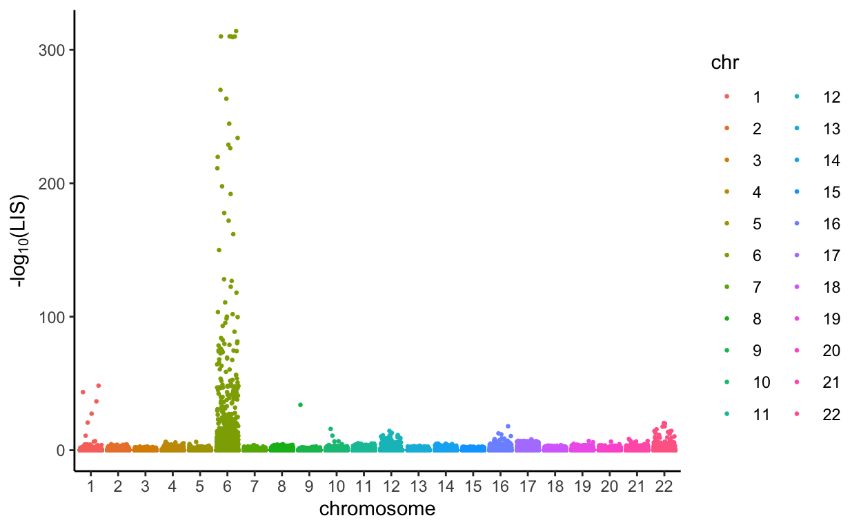
Plot the result given by PLIS procedure in a Manhattan plot
Using PLIS procedure, we controlled the global false discovery rate(FDR) at 0.01. Then, at an FDR of 0.01, PLIS procedure categorized that the SNPs in green are associated with Type I Diabetes, and the SNPs in red are not associated with Type II Diabetes.
all.Rlts %>%
  mutate(minusloglis = -log10(LIS),
         chr = as.factor(chromosome)) %>%
  ggplot(aes(x = chr, y = minusloglis, group = interaction(chr, base_pair_location), color = (fdr001state==1))) +
  geom_jitter(size=0.5) +
  labs(x = 'chromosome', y = expression(paste('-log'[10],'(LIS)'))) +
  theme_classic()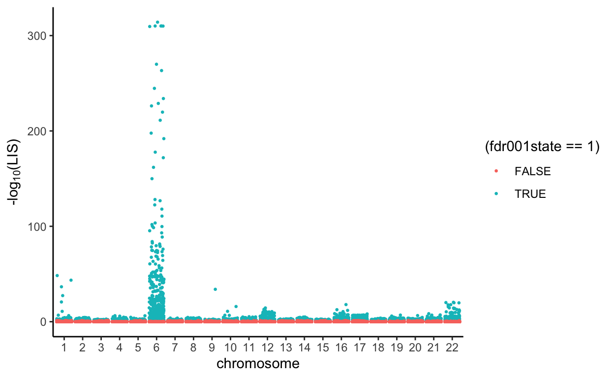
Plot the results by ranking p-values in the given dataset in another Manhattan plot
all.Rlts %>%
  mutate(minuslogp = -log10(p_value),
         chr = as.factor(chromosome)) %>%
  ggplot(aes(x = chr, y = minuslogp, group = interaction(chr, base_pair_location), color = chr)) +
  geom_jitter(size=0.5) +
  labs(x = 'chromosome', y = expression(paste('-log'[10],'(p-value)'))) +
  theme_classic()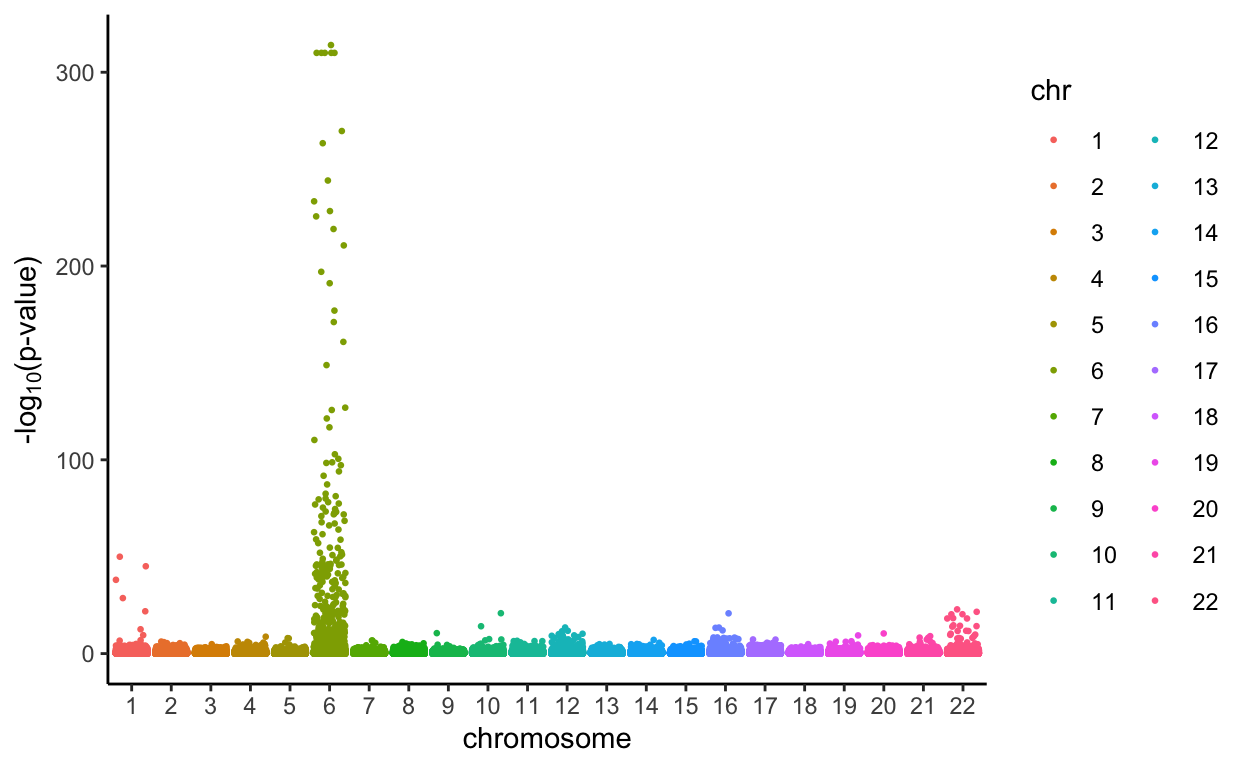
Plot the results by ranking p-values in the given dataset in another Manhattan plot
We used Bonferroni’s correction to determine the appropriate p-value threshold when we have 22*5000 independent tests, and the threshold is calculated as
0.05/(22*500)[1] 4.545455e-06Then, the SNPs with p-values lower than the threshold above are categorized as associated with Type I Diabetes (green), and the SNPs with p-values equal to or bigger than the threshold are categorized as not assciated with the disease (red).
all.Rlts %>%
  mutate(minuslogp = -log10(p_value),
         chr = as.factor(chromosome)) %>%
  ggplot(aes(x = chr, y = minuslogp, group = interaction(chr, base_pair_location), color = (p_value<0.05/(22*500)))) +
  geom_jitter(size=0.5) +
  labs(x = 'chromosome', y = expression(paste('-log'[10],'(p-value)'))) +
  theme_classic()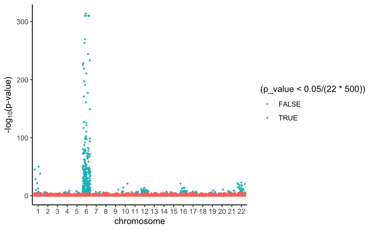
From the Manhattan Plots, we notice that more SNPs are considered to be associated with Type I Diabetes when using the PLIS procedure, and the Bonferroni’s correction is much more conservative than that.
How similar are the results? Count shared SNPs in top K in both rankings.
Although the two Manhattan plots above look very similar, the specific rankings of SNPs are quite different. Note: With the help of PLIS procedure, we ranked SNPs by their LIS test statistic from small to large. With conventional p-value procedure, we ranked SNPs by their individual p-values from small to large.
# Check how many SNPs are shared in the top 10 given by both procedures
length(intersect(all.Rlts[order(all.Rlts[,"LIS"])[1:10],]$variant_id, all.Rlts[order(all.Rlts[,"p_value"])[1:10],]$variant_id))
[1] 10# Check how many SNPs are shared in the top 100 given by both procedures
length(intersect(all.Rlts[order(all.Rlts[,"LIS"])[1:100],]$variant_id, all.Rlts[order(all.Rlts[,"p_value"])[1:100],]$variant_id))[1] 100# Check how many SNPs are shared in the top 500 given by both procedures
length(intersect(all.Rlts[order(all.Rlts[,"LIS"])[1:500],]$variant_id, all.Rlts[order(all.Rlts[,"p_value"])[1:500],]$variant_id))[1] 392# Check how many SNPs are shared in the top 1000 given by both procedures
length(intersect(all.Rlts[order(all.Rlts[,"LIS"])[1:1000],]$variant_id, all.Rlts[order(all.Rlts[,"p_value"])[1:1000],]$variant_id))[1] 697Since we have conducted a simulation and showed the PLIS procedure has a higher sensitivity at nearby SNPs of causal SNPs, we would believe the PLIS procedure yielded better results.